Client |
Brief |
Deliverables |
|
Chosen With Care
|
To design an online presence for a family run care home, allowing prospective families to see the facilities online.
|
Wireframe, Visual Design, UX interactions
|
CHOSEN WITH CARE
Chosen with care is a family run care home service that help clients find the best possible care for their particular needs. They offer independent, impartial advice to care home owners who want to provide the best service they can for their clients and their relatives.
After meeting the founder of Chosen with care she took me through her people first approach. Too many care homes focus on the cost of their services, while Chosen with Care will focus on the environment and relationships elderly people can form when living in one of their partner homes. They work to all different budgets and follow up with their customers regularly to ensure they still enjoying their experiences.
After meeting the founder of Chosen with care she took me through her people first approach. Too many care homes focus on the cost of their services, while Chosen with Care will focus on the environment and relationships elderly people can form when living in one of their partner homes. They work to all different budgets and follow up with their customers regularly to ensure they still enjoying their experiences.
MY ROLE
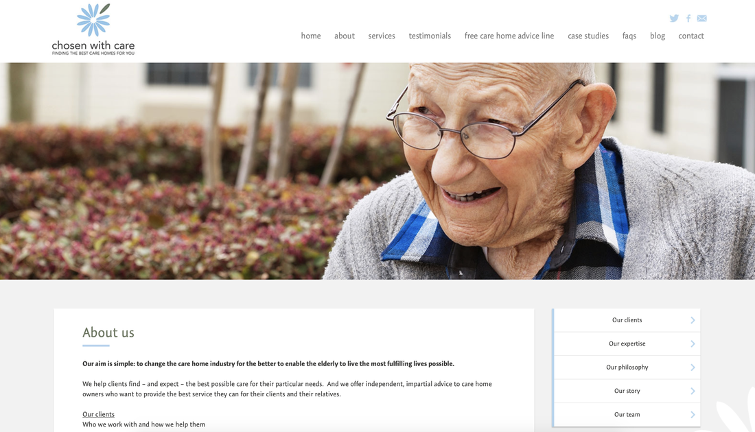
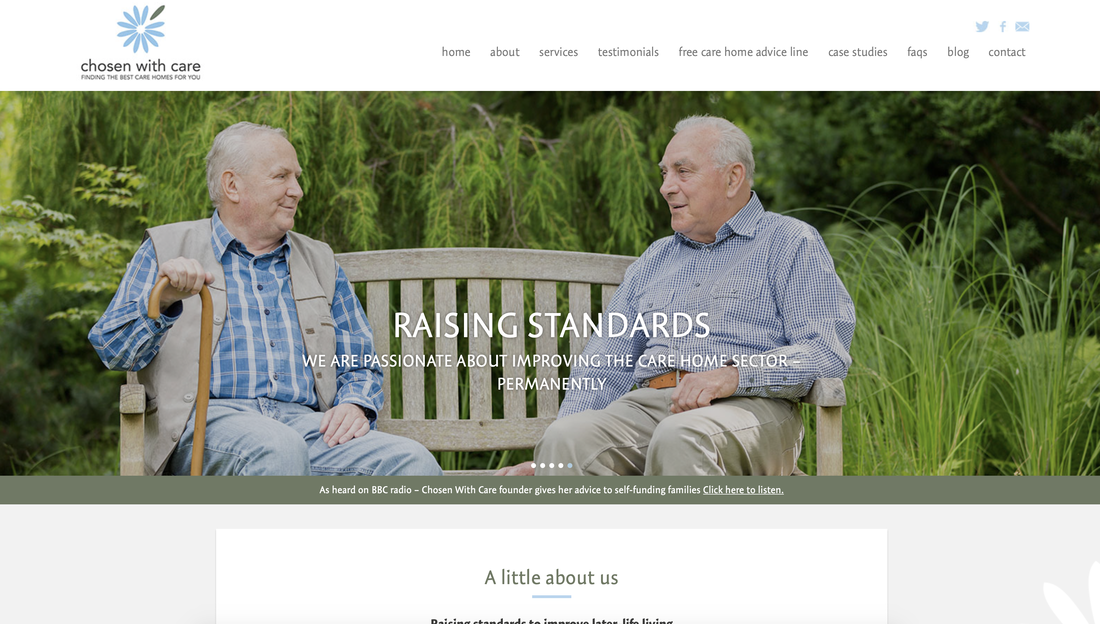
The people first approach really helped me focus the design work as the sole product designer for this brief. Right off the back, I commissioned a photographer to shadow the founder and take photography of the people and families she'd interact with when maintaining her usual care home schedule. I knew I was going to feature a natural photography focus for the site, paired with softer relaxing blue tones for the composition to frame the photography.
I worked in Sketch to outline the structure of the site, photoshop to edit the photography, and illustrator to convert the logo from a pixelated png file, to a scalable vector file so it wouldn't break when using it on the responsive site.
I worked in Sketch to outline the structure of the site, photoshop to edit the photography, and illustrator to convert the logo from a pixelated png file, to a scalable vector file so it wouldn't break when using it on the responsive site.
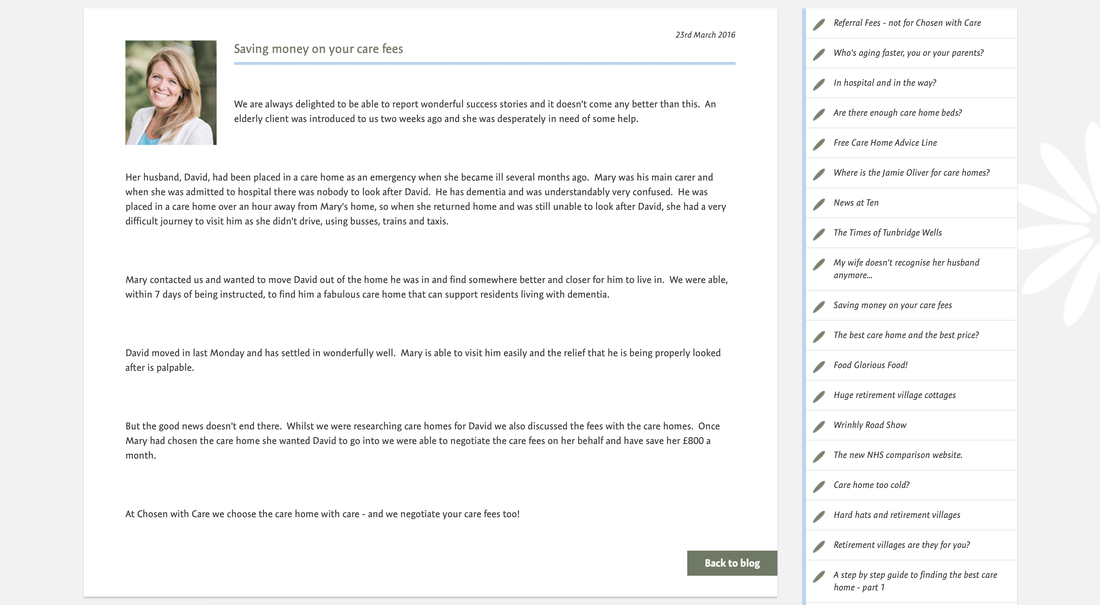
It was decided by the design agency as part of the package offer, that the website would include a blog. I was given the task to make the blog approachable, despite sometimes covering heavy topics such as pension eligibility and government schemes. I decided to use elements of the petal branding paired with each blog post to signify these are all parts of the bigger picture and are all connected to the company mission.
Photography crept into the blog too, using faces and personal photography rather than of buildings to make the posting again seem more personal, and putting a face to the brand.
Whenever possible I prompted the founders to relate to the content with their own families, mentioning their parents, siblings and their experiences to again appear honest and open.
Testimonials were a huge part of the website, so I decided to gather multiple interviews that the founders had gathered over many years and filter them through to find the best sound bytes to include on the site. These worked due to the difference in voice, up until now the website just indicated the companies TOV, but this allowed the customers to be introduced and provide honest feedback for using this service.