Design Process & Management Style
I'm experienced in building design teams in Fintech banks at startups & FTSE100 companies
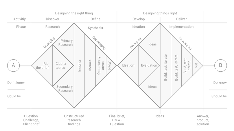
I follow the Double diamond design process.
This helps us follow an agile workflow.
Divided into four distinct phases – Discover, Define, Develop and Deliver
The Double Diamond is a simple visual map of the design process.
In all creative processes a number of possible ideas are created, divergent
thinking, before refining and narrowing down to the best idea, convergent
thinking, - this can be represented by a diamond shape. But the Double Diamond
indicates that this happens twice – once to confirm the problem definition and
once to create the solution. One of the greatest mistakes is to omit the left-hand
diamond and end up solving the wrong problem.
In order to discover which ideas are best, the creative process is iterative.
This means that ideas are developed, tested and refined a number of times, with
weak ideas dropped in the process. This cycle is an essential part of good design.
Practical design methods – like user diaries, journey mapping and character
profiles – move a project through the four phases of the Double Diamond.
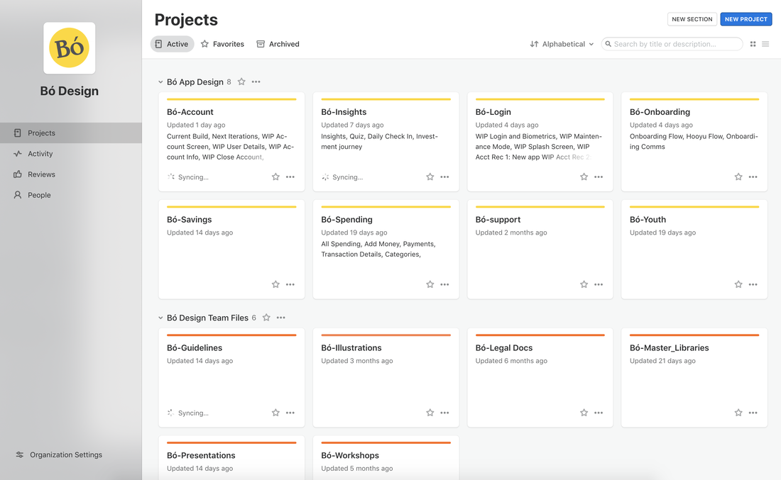
DATA DRIVEN, CUSTOMER FIRST APPROACH
Failing to consider data (or using data in an ineffective way) can have serious implications for the success of a project. If you rely solely on instinct or best practices to make decisions without performing any data-driven investigation, you risk wasting money on changes to design choices that are ineffective (or even harmful).
"companies in the top third of their industry in the use of data-driven decision making were, on average, 5 percent more productive and 6 percent more profitable than their competitors.”
"companies in the top third of their industry in the use of data-driven decision making were, on average, 5 percent more productive and 6 percent more profitable than their competitors.”
DESIGN SOFTWARE


|

|
|
|
|
|
|
|

|
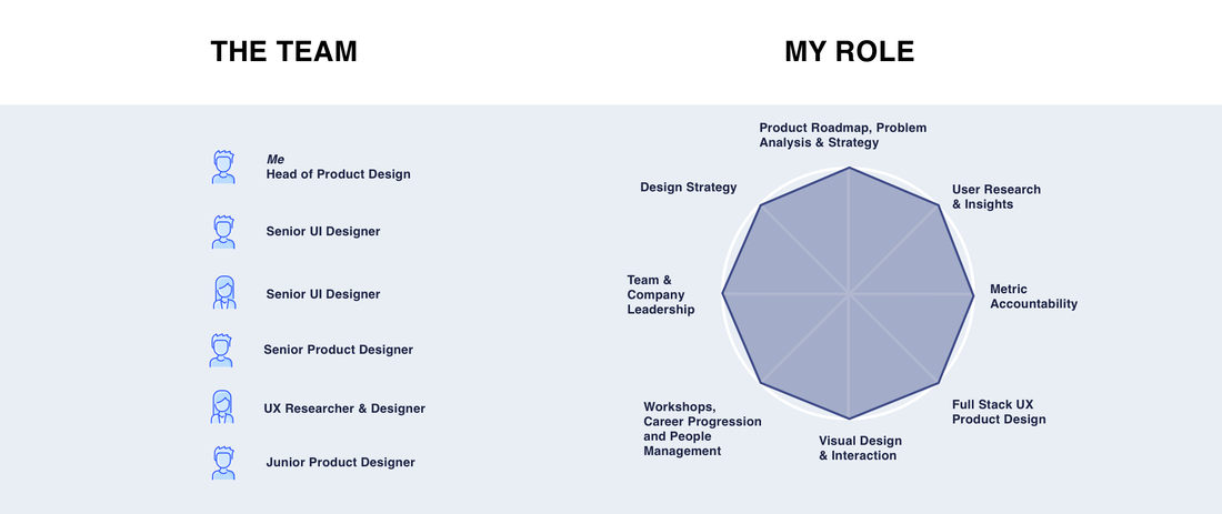
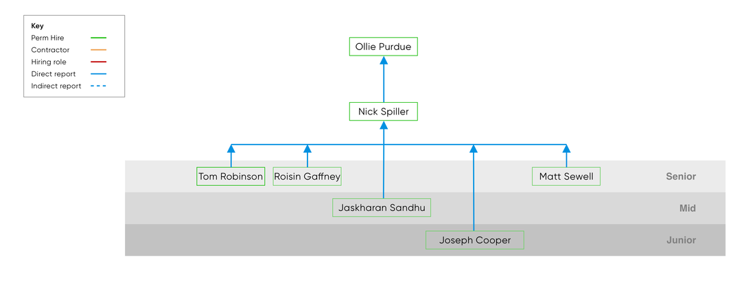
TEAM STRUCTURE
I always plan my design team budget over the course of 6 months and again at a year. This allows me to run two consecutive hiring plans and understand what roles I want to open in the future.
T-SHAPED DESIGNER PREFERENCE
“Being a generalist is great for at least 80% of cases where a designer is needed. Most companies don’t need full-time specialists all of the time.”
“Generalists first, specialists last.”
Description
As we move to cross functional teams, it’s important to re-evaluate if our current team are providing efficient value from a design stand point. We should also ensure we have a plan moving forwards regarding hiring and any team training we need to provide.
A specialist designer is a designer who is really good at one area of design, perhaps animation.
A generalist designer is a designer who understands the full product lifecycle, and has the skill to carry a brief from UX through UI, to developer handover.
Pros Generalist
-Full skillset to get things done, individually.
-Great at kick starting a project, not great at the details.
-Doesn’t like all areas of product design
Cons Generalist
-Jack of all trades, master of none.
-Slower at doing tasks
-Lack of polish to individual tasks
-Lack of specialism understanding
Pros Specialist
-Efficient at individual tasks
-Produces high quality outcomes
-Likely started as a generalist before specialising
Cons Specialist
-One trick pony
-Team requires multiple hires to fill gaps
-Not understand full product design process
-Spend lots of time waiting between tasks until a task requires their skillset
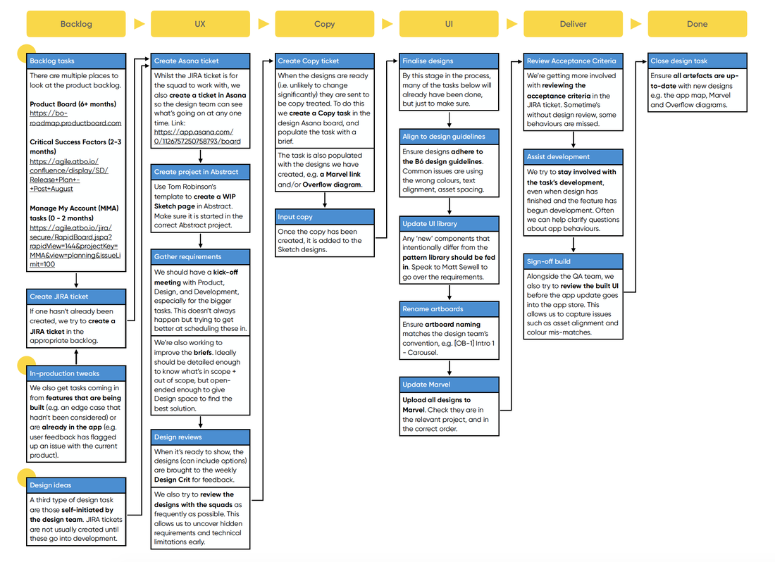
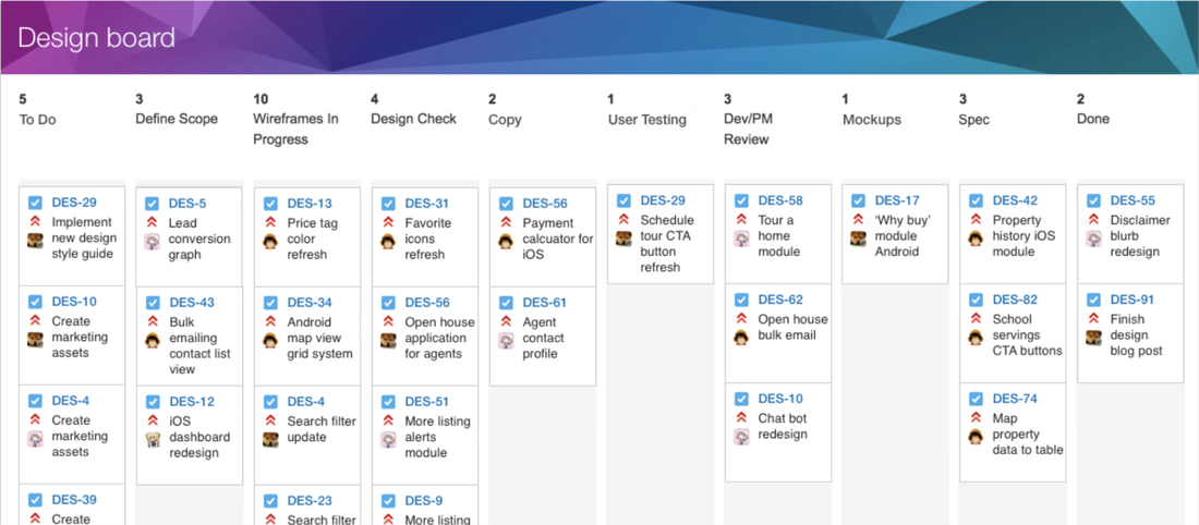
PROJECT SETUP & SCRUM WORKFLOW
A Scrum Board (also called Scrum Task Board) is a tool that helps Teams make Sprint Backlog items visible. The board can take many physical (i.e. whiteboard and stickers) and virtual forms (i.e. software tools) but it performs the same function regardless of how it looks. A Scrum Board is the focal point of any agile project and serves as a good place at which to hold the stand-up meeting. The board is updated and referred by the Team and shows all items during the Daily Scrum keeps the team focused on the tasks that remain and their priorities.
- Promotes team interaction and discussion– Throughout the day you will see teammates, stakeholders and members of other teams stop by the board for discussion. This increases greatly if the board is located near the team and highly visible
- Visibility– Anyone walking buy can make a quick second assessment on where the team is in the iteration. No cards left for a row? That story is complete. No white cards left, just green cards? Only testing remains. Lots of pink cards? Lots of defects.
- Good for new teams to visualise Scrum– By having this tangible thing in front of them that they can touch, makes it easier for new teams to understand the process
- Support full team commitment– Now the whole team sees all of the tasks daily and keeps them from just focusing on “their” tasks. When using task tracking tools it is too easy to just create a view of “my tasks” and then tune out the rest.
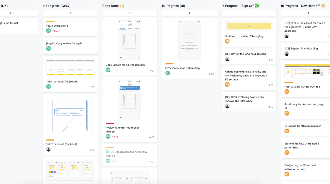
TEAM WORKFLOW
SOFTWARE AND VERSION CONTROL
For many teams of designers, version control can prove to be a tricky area to overcome. The process of working on multiple files at the same time, only really breaks when you have more than one designer in a CFT/Squad. We use Abstract for our version control, given we have many designers working across many different projects which can overlap occasionally.
We also use Abstract to balance our single source of truth and our WIP files. I took the decision quite early on, to split design files in two, one including the MASTER and next iteration of a tabor design, and the other including any exploratory work.
This massively helped when we scaled the design team with new joiners, as they knew what files were where from day one on the design team.
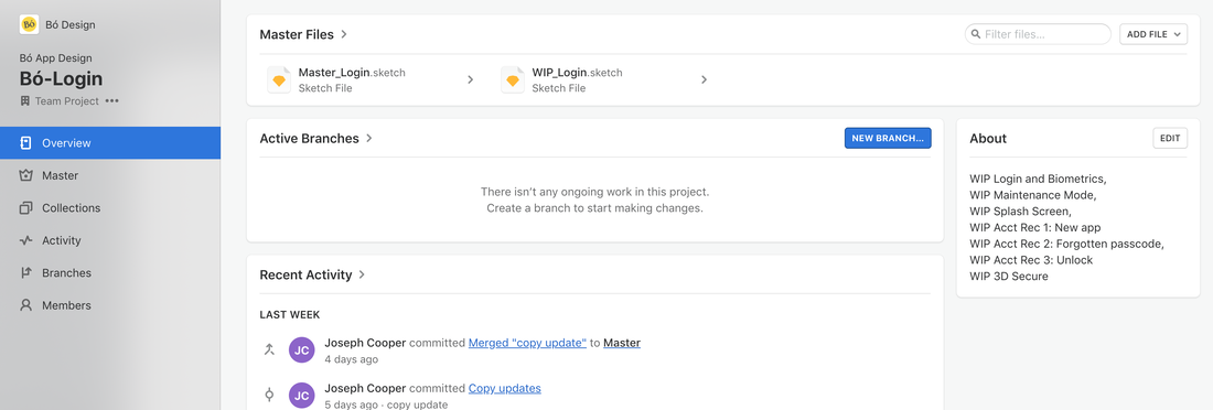
DESIGN SOURCE OF TRUTH
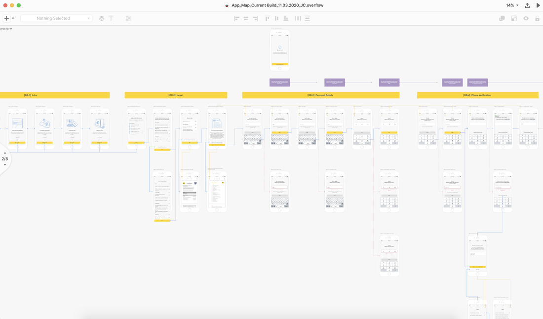
Single source of truth (SSOT) is a concept used to ensure that everyone in an product team (engineers, designers, pm's) can reference to check what is the true version of an app.Creating a single source of truth is straightforward. To put an SSOT in place, a company must ensure they keep one platform which only shows LIVE designs. I created an overflow app map for ours which would outline the full app design, inclusive of every use case and bad flow journey in a single, but large document. This document has proven invaluable to data teams and UX researchers when mapping and analysing drop off points.
DESIGN FILE QA
This is the process of reviewing visual designs, micro interactions, and copywriting by cross-checking the developed design vs. your handed-off design before production to find any inconsistencies. The goal of a Design QA is to ensure that quality and expected design output are deployed during production.
|
|
USER RESEARCH & TESTING REPOSITORY
|
|
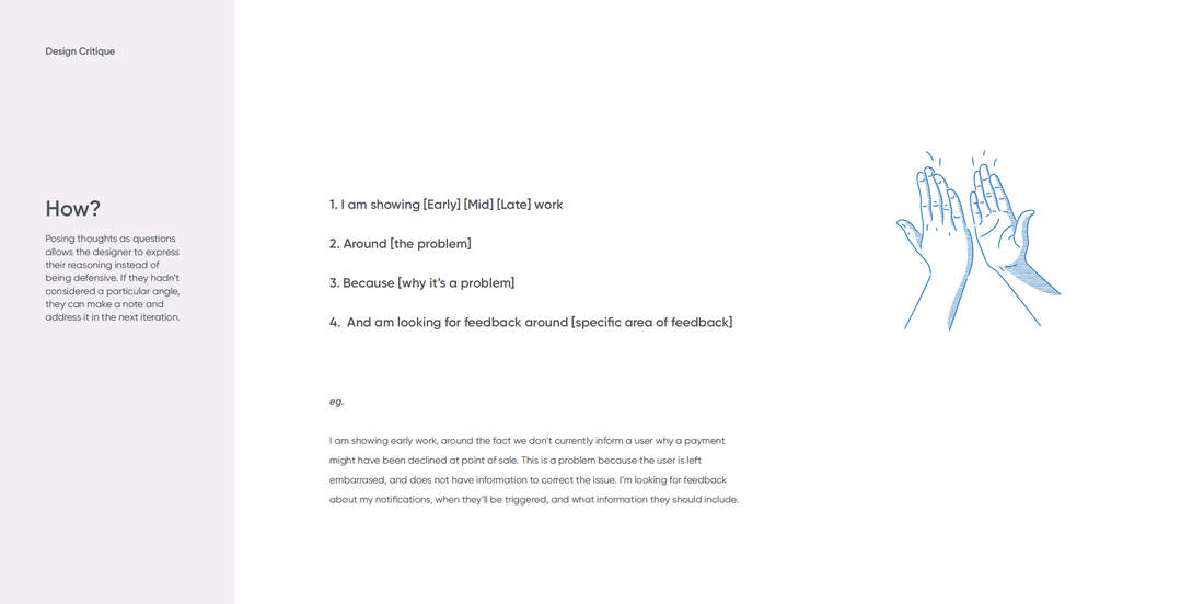
DESIGN TEAM ROUND TABLE REVIEWS
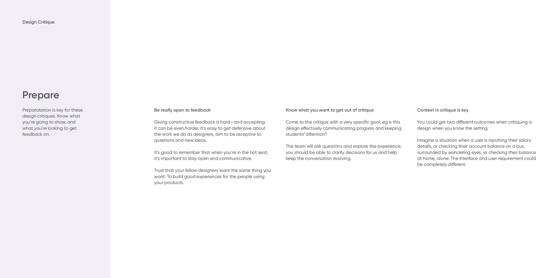
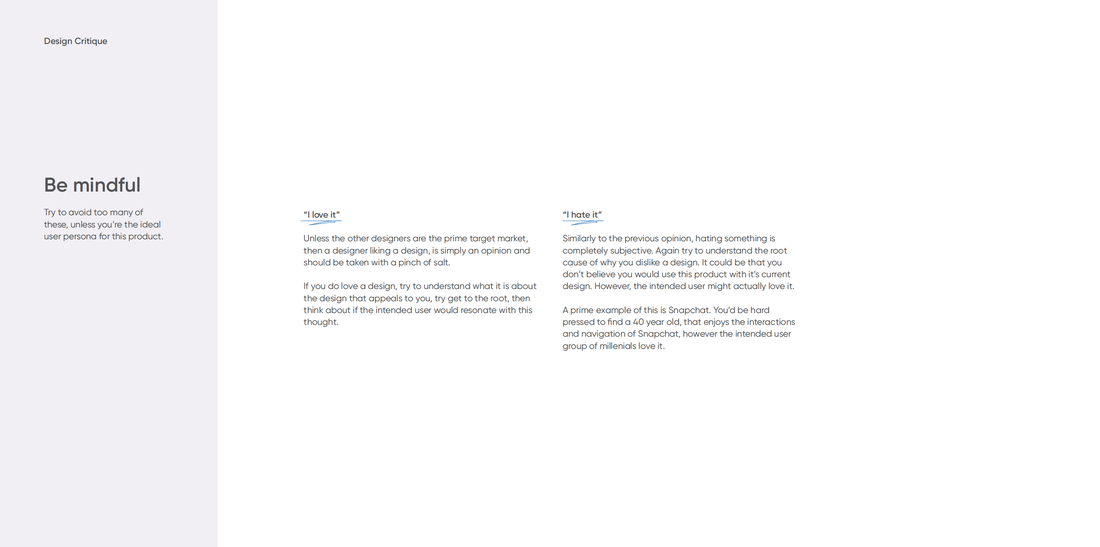
We want to strive for a more collaborative design team, so we can help solve problems together.
Critiques are not limited to just the design team, but we want to restrict the number of attendees to ensure valuable feedback is being shared.
We want these meetings to avoid being a presentation of your final proposed solution, but rather showing a fork in the road, where you’re seeking direction.
These meetings will be once a week. With a variety of people displaying a snippet of work for 10-15mins each.
Silos
As designers it’s important to not work in silo’s, a
It’s easy working in cross functional teams, and feature teams to get swept up by the pace and structure of your team.
This is a very common catalyst of becoming a silo’d design team. Traits of this could be;
-Unsure what team mates are working on,
-One team member being swamped, while another has nothing todo.
-Little feedback being passed between designers.
-Feedback only coming from PO’s or developers.
Collaboration
We want to shift towards a design team that pushes and challenges each others designs.
As a team, we want to challenge our assumptions and then test them in a systematic way.
This is a better alternative to simply asking people what they want, and think.
Scale
Once we have a collaborative design team, it will be easier to scale the teams over multiple cross functional teams.
Scaling the design team is always a testing.
By implementing scalable processes now, we futureproof ourselves.
Pattern library, sprint planning & retrospectives and shared file management, can all be examples of scalable processes.
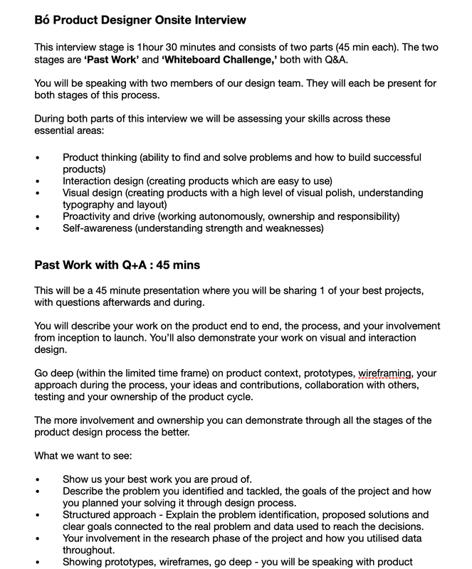
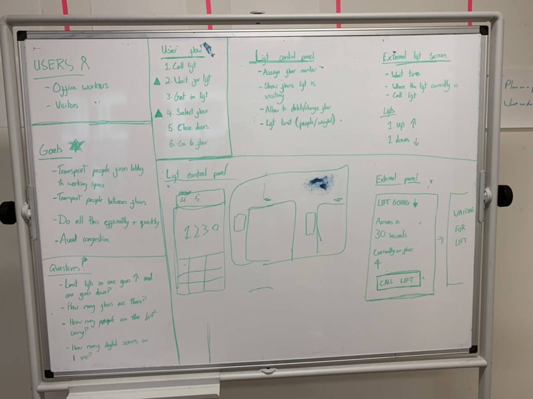
INTERVIEW PROCESS & TEAM HIRING
|
|
CAREER DEVELOPMENT PLAN
The design industry has evolved significantly over the past 10 years, but there’s a ways to go before the design discipline is universally understood and embraced. Two things are certain, though: People expect a useful, usable and delightful product experience, and designers are more in-demand than ever.
That said, the role of the designer is still in flux. It wasn’t so long ago that having access to a designer felt like a luxury — practically expendable and certainly questionable in terms of importance. Today’s designers have a much more stable career path compared to a decade ago, and new fields are emerging all the time. Augmented reality, virtual reality, artificial intelligence, machine learning, invisible voice-driven interfaces — the scope of what designers now touch and influence has exploded.
As a result of this I have created a design career development process to help designers decipher their current strengths and areas they need to improve to grow as a designer.
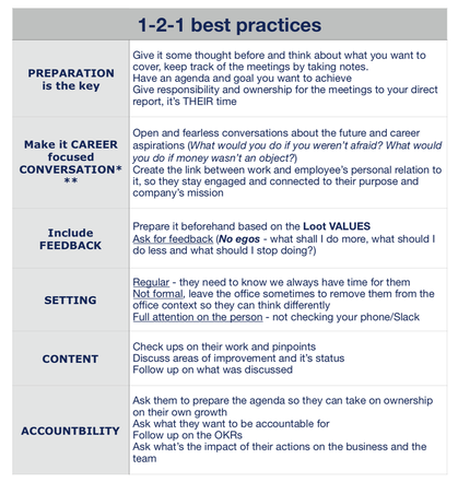
TEAM MEMBER 1:1
FILE NAMING CONVENTIONS
Problems we're trying to correct
❌Each squad and designer is using a different organising system for their files and artboards
❌Artboards do not have a single naming convention, making it difficult to reference across tools
❌Looking at a Sketch file, it is difficult to know which area already in production, and which are exploratory
✅Adopt a uniform organising system that can be used across designers, design teams and squads
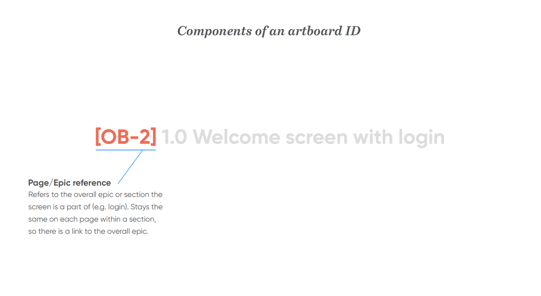
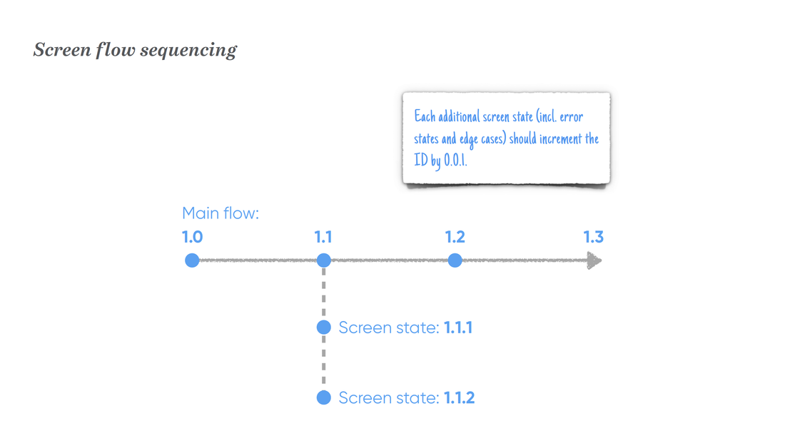
✅Every individual dartboard should have a unique ID, that matches across Sketch, Marvel, Jira etc
✅Our system should extend to Sketch files themselves, so anyone can tell the status of a screen.
❌Each squad and designer is using a different organising system for their files and artboards
❌Artboards do not have a single naming convention, making it difficult to reference across tools
❌Looking at a Sketch file, it is difficult to know which area already in production, and which are exploratory
✅Adopt a uniform organising system that can be used across designers, design teams and squads
✅Every individual dartboard should have a unique ID, that matches across Sketch, Marvel, Jira etc
✅Our system should extend to Sketch files themselves, so anyone can tell the status of a screen.
|
|
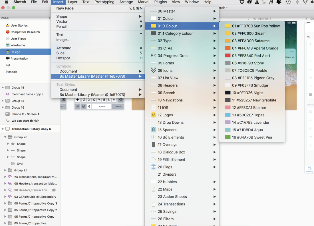
LIBRARIES & STYLEGUIDES
Ensure a cohesive product design and user experience by implementing a styleguide.
UI Style Guides are a design and development tool that brings cohesion to a digital product’s user interface and experience. At their core, they:
-Record all of the design elements and interactions that occur within a product
-List crucial UI components such as buttons, typography, colour, navigation menus, etc.
-Document important UX components like hover states, dropdown fills, animations, etc.
-Contain live elements and code snippets for developers to reference and use
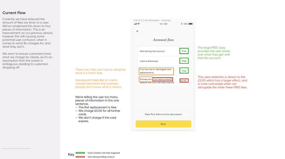
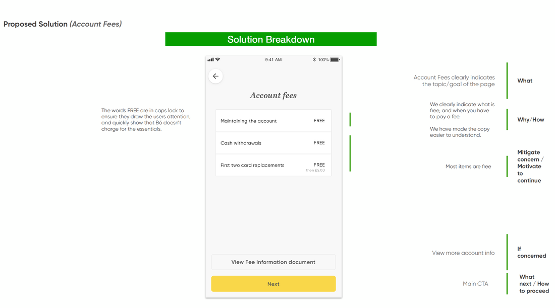
UX COPY PROCESS
As copy has a number of stakeholders, the designer will write the initial copy directly into the design, but is not usually involved in the final sign off. Instead the UX copywriter will liaise with the marketing team to decide on copy which conforms to the tone of voice guidelines. The designer will work alongside the UX copywriter and together they will agree the final copy.
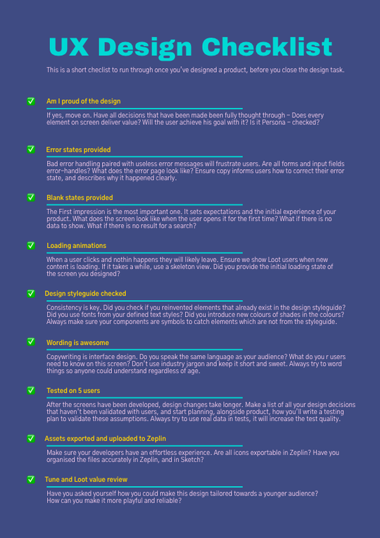
DESIGN CHECKLIST
DESIGN PRINCIPLES
1: Visibility & Insight
2: Growth through community
3: Inform & Educate
4: Un-intrusive budgeting and control Bonus: Deals & Discounts
1: Whatʼs the problem?
Every feature should solve a problem. Every problem belongs to a person. Tell a story of how we fit into their lives and how we resolve their problems.
The number of features will not determine the success of our app if theyʼre not valuable and impactful.
2: We trade in convenience so Simplify & Clarify everything for the user:
We trade in convenience. Automate the tedious. Spice up the boring. Simplify and clarify the complex. Donʼt choose the easy way if itʼs at the expense of the userʼs experience.
In design, focus on bringing clarity with differentiating element via weight, structure, contrast, balance, grouping and size. The same content laid out with good design is already simpler to understand.
This also means a solid and fast app, that will not inconvenience any user task. The only way to make sure weʼve done this right is to test it with our target users.
3: Provide seamless and timely insights:
What can we tell the user that they didnʼt already know or donʼt have the time or energy to find out?
Users should be able to get meaningful information about their spending & habits at a glance.
Providing seamless value that layers on how users behave naturally will result in them using us more, so we can start giving them even more insight and value.
4: Be human & friendly:
Thereʼs enough banks that are corporate and jargon-heavy. We have the opportunity to bring a human face to money management.
We can also help people connect and express themselves in their communities, even when it comes to something like money.
5: Style and Substance
If our app is to sell itself and people are to advocate for it, what is that wow factor, that cool factor that will attract the attention?
But of course looks without functionality donʼt add much, so everything has to be backed up with great functionality.
DESIGN METRICS
Design aims to measure and be accountable for three main metrics.
-Effectiveness
-Efficiency
-Satisfaction
We measure these through:
1. Creating a Syetem Usability Scale (SUS)
A scale for measuring product intuitiveness over time
2. Measure completion rate, including 'time take'
-Time taken on the first attempt
-Time taken to perform a task compared to an expert
- Time taken correcting errors
3. Net promotor score (NPS)
-Review if a feature improves customer retention
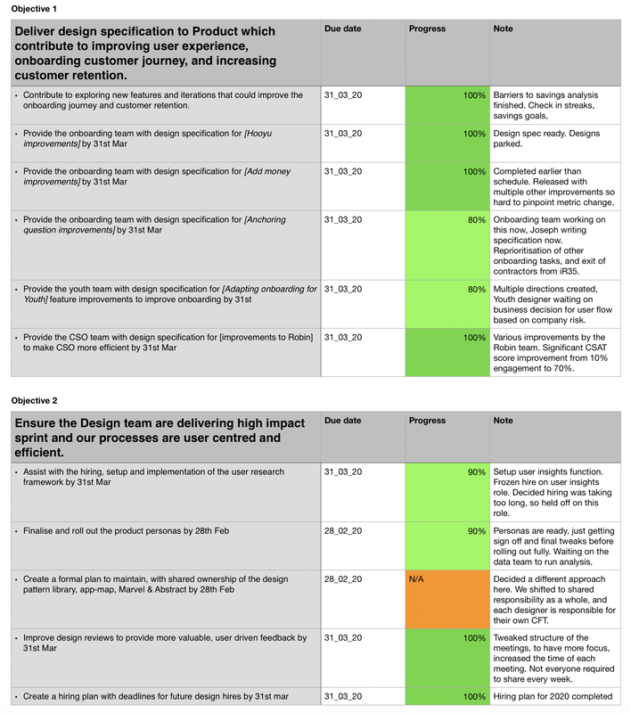
DESIGN OKRS
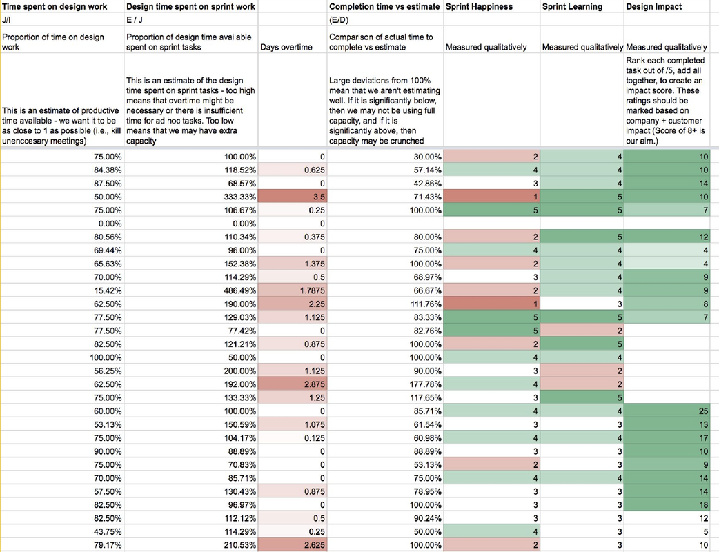
RETROSPECTIVES & SPRINT IMPACT
SOFTWARE SUGGESTIONS AND WORKSHOPS
I regularly run workshops on:
1. Adobe illustrator
2. Logo creation
3. Interaction design
4. Presentation techniques
5. Creating user personas
6. UX copywriting
7. Webflow
8. After effects animation
9. Website development and deployment
10. React native
11. Portfolio Building
I store all my study notes in drive, and aim to support the team with a workshop every 2 weeks.
REMOTE WORKING INITIATIVES
As a design team, we need to stay creative.
Staring at the same four walls sometimes isn't the best way to stay creative. So every month we cancel all meetings for the day and as a team, work from somewhere creative and different.
This will likely be from a coffee shop, a shared office space, or another companies workspace. Previous visits have been to Facebook, Amazon, The British Library, Sainsburys, and Lloyds Bank
