XSEALED -
A case study of a full redesign and rearchitecture for a photo and password storage manager application for iOS.
Background information
WHAT IS XSEALED?
XSealed is a personal storage iOS application. The app allows it's users to store their personal documents such as passwords, photos, credit card details and logins in a super secured vault which is secured by bank level security and validated by ethical hackers from GCHQ.
THE PROBLEM
Previously the product was called FaceCrypt, and received growth of 1000%+ when it originally launched in 2016, however while customers still bought subscriptions for the product, the visual design became outdated, due to the fast paced visual trends. This in turn led to slower growth and less revenue. While the product's value proposition was strong, the application fell short on the experience side, and looking at the data the onboarding and conversion metrics were beginning to slip.
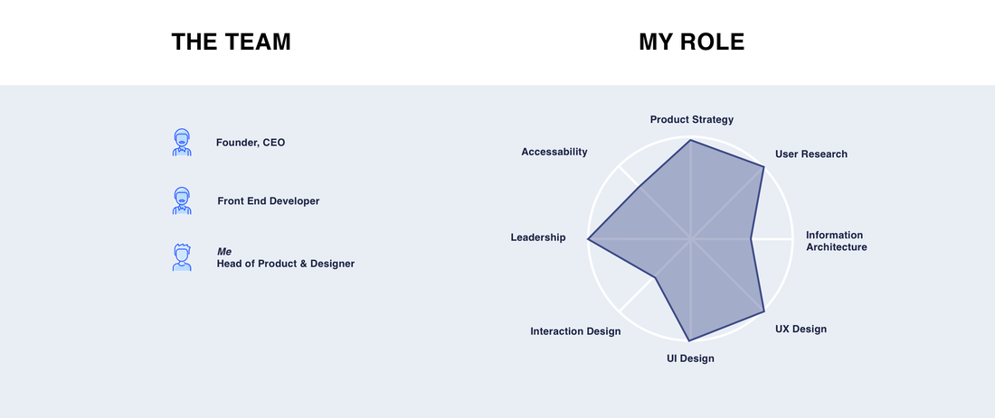
MY ROLE
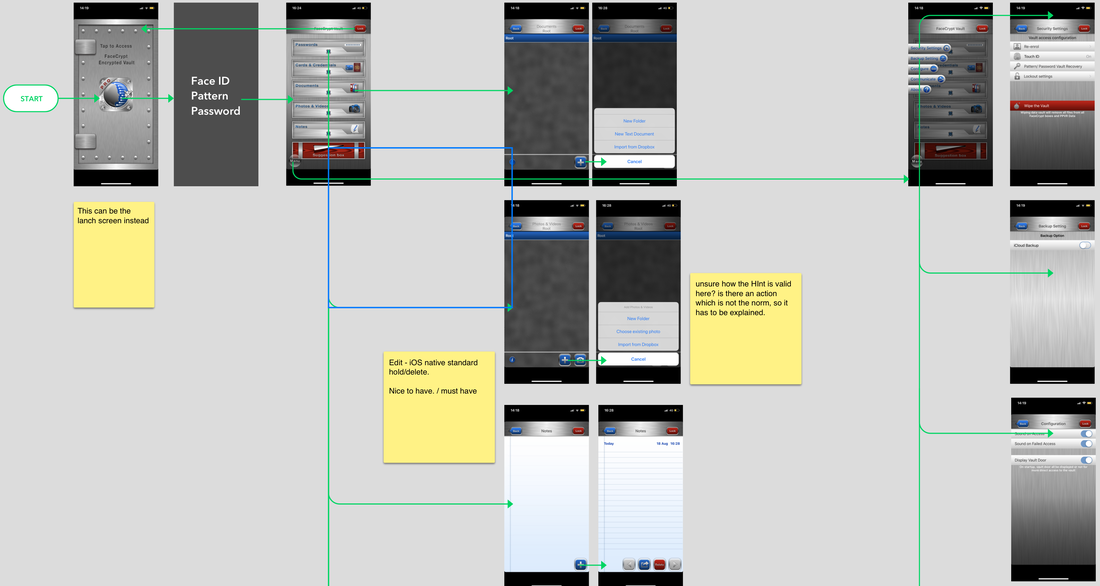
I was brought on board to conduct a full analysis of the app, and to map out all functionality currently offered. Due to majority of the development being communicated directly from the founder to the development team, there was little to no documentation outlining the current features or app map of FaceCrypt.
My role then developed into conducting research into the current landscape, as it had changed dramatically over the last 4 years thanks to competitors like 1Password.
After I had conducted the research, I was tasked with crafting a full redesign of the product, to redefine the feature flows and visual design the app provides. This was backed up with research and data.
UX AUDIT OF CURRENT FLOW
I conducted a UX audit of the FaceCrypt application to understand what was broken and what could be improved when considering a redesign. Notable areas of improvement were the faceID login section. This used a company called iProov which had been integrated before biometric camera mechanisms were introduced into devices. The existing app was created when Skuermorphism was a widely adopted design style, however trends have since changed.
MARKET RESEARCH & SURVEYS
After myself and the founder had discussed the flows that didn't work and could be improved we decided that it would be best to understand if there was still a market for a storage product like FaceCrypt, or if the market had shifted being another potential reason why sign ups had dropped over the past year.
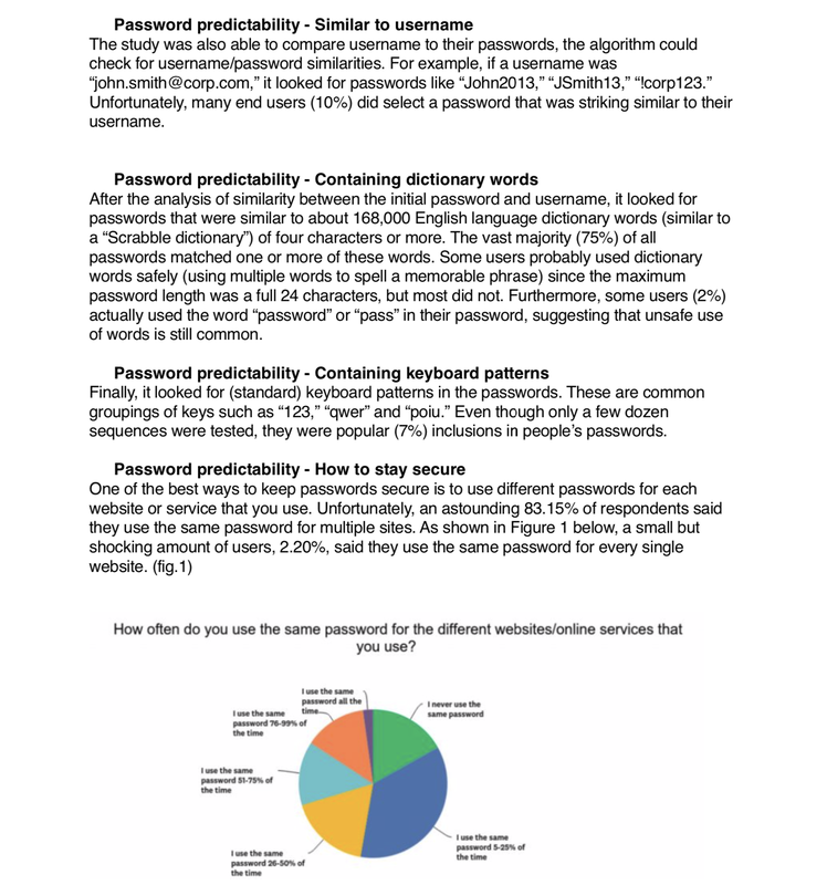
My research consisted of surveys around password requirements and photo storage needs to validate the apps primary proposition. Alongside this, I conducted various SWOT analysis on competitors to understand if they had eaten into the same market.
My research consisted of surveys around password requirements and photo storage needs to validate the apps primary proposition. Alongside this, I conducted various SWOT analysis on competitors to understand if they had eaten into the same market.
USER FLOW & APP ARCHITECTURE
The existing application had a number of hidden features which were large enough to cause confusion, but not essential enough to add value to the proposition. I started with the best possible (blue skys) app map, and redefined the whole of flow of the app based on my earlier research and user requirements.
WIREFRAMING THE SOLUTION
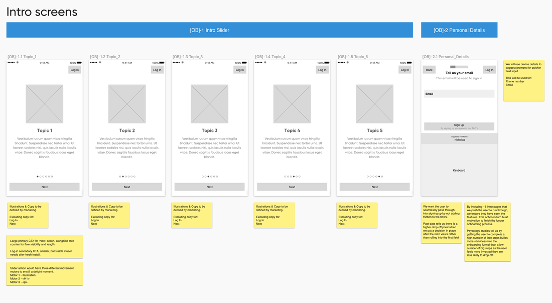
After the founder and I had decided on the user flow, I started working on the applications wireframes. I wanted to ensure that we conveyed the security message throughout the onboarding process as this was the USP for the application.
DEFINING THE NEW BRAND
Alongside the application redesign, we decided to re-launch under a new brand name and image, to remove any affiliation with the retired previous brand. I created a branding that would hint to the nature of the application, but not introduce any negative connotations.
CONCEPT TESTING
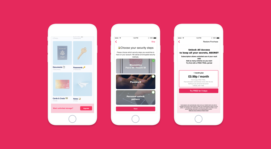
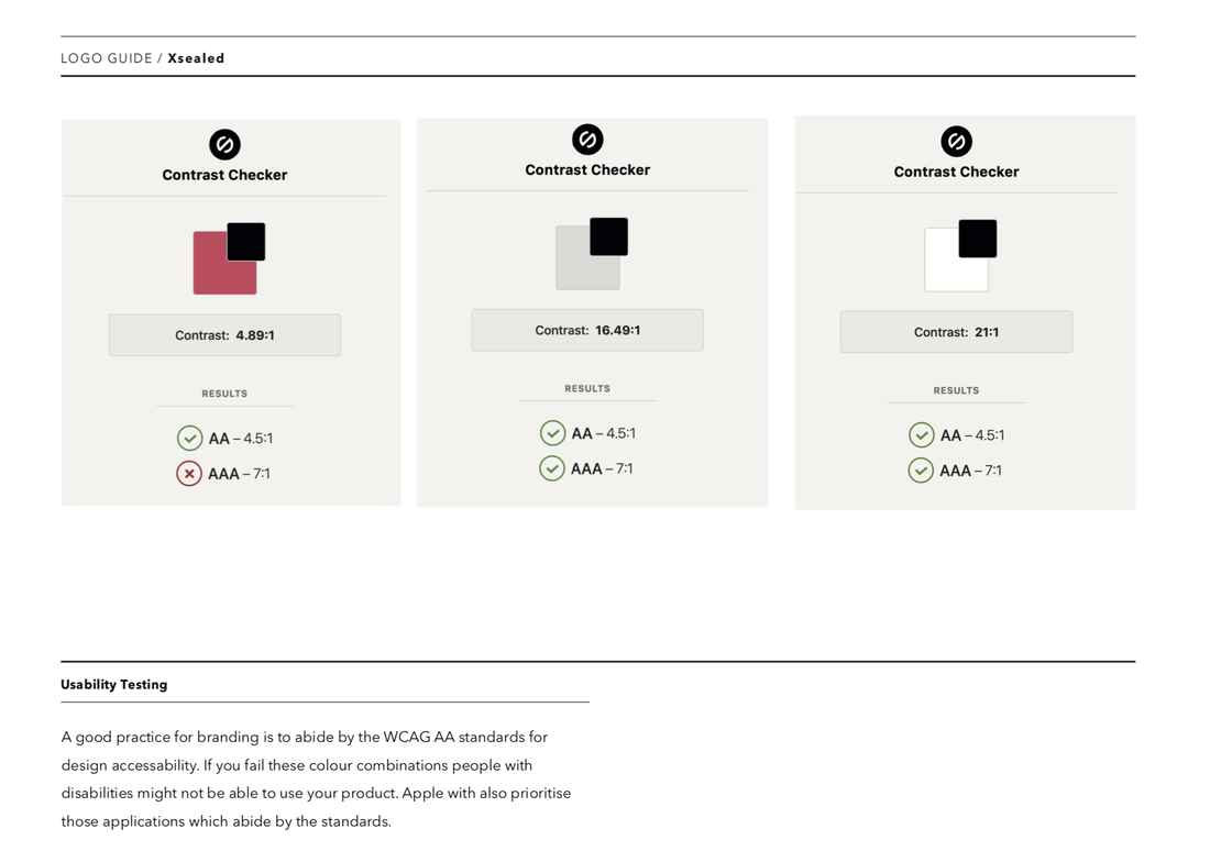
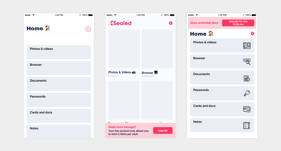
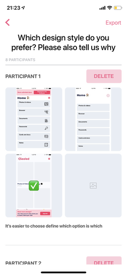
After we had defined the brand colours and typefaces to be associated with the brand, I started work on the main app design. The design went through various iterations before we landed on the final style. I wanted this to be adaptable, focussing around imagery to reduce cognitive load, as users stated they would be using the product in a rush in most cases, and would want access to their passwords quickly.
HI-FI DESIGN
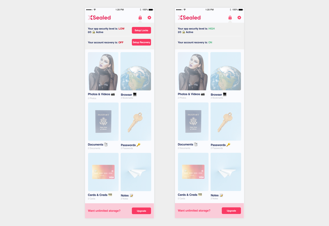
The final design needed to be adaptable so we could bring important information into focus, but without crowding the design.
NEW WEBSITE
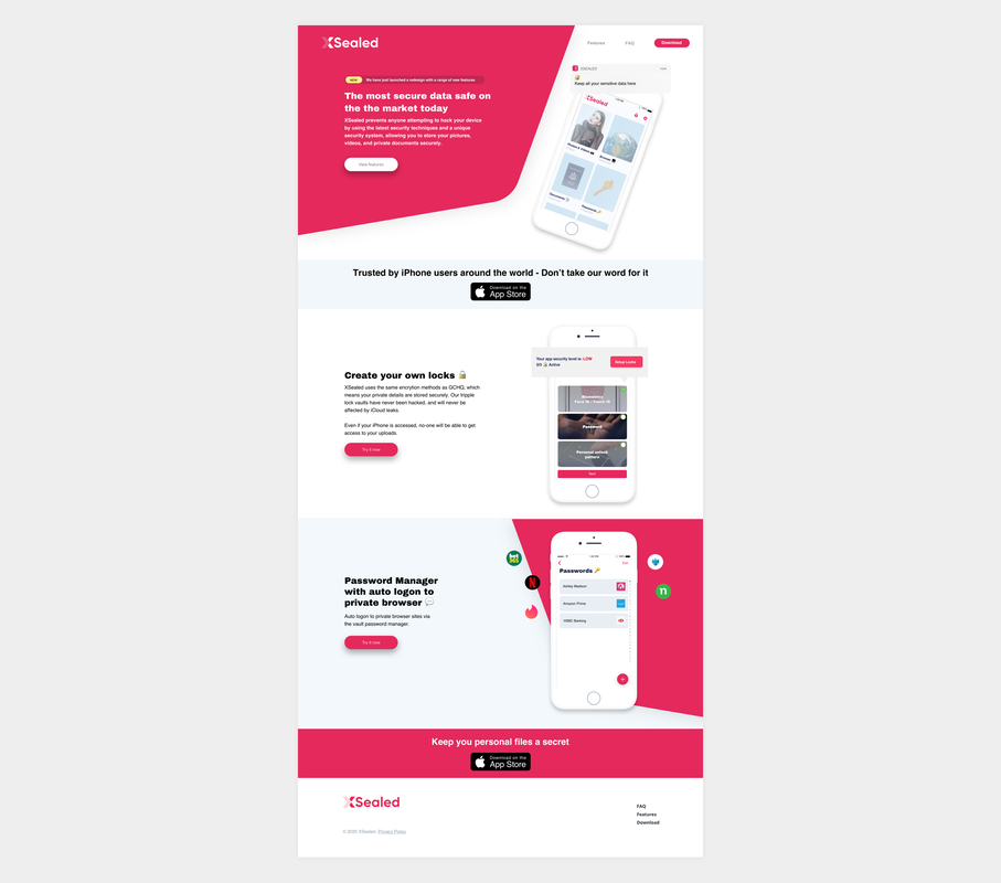
To accompany the new brand, a new website was created to promote the application.
TL;DR
I validated the proposition for an existing outdated photo & password manager application. I redesigned the experience and visual design based on various market research and user testing.
